Ever since I introduced art into the world of Kimberley’s Kyusu & began doing round ups of the exhibitions I was given the opportunity to visit over on my Instagram, I have been eager to bring those round up posts over to the blog and break free of Instagram’s character limit so I could discuss the exhibitions and the overall experience of each visit, as it can be quite hard to fit everything I want to say about these exhibitions and the galleries they are held within, with a character limit of 2,200.
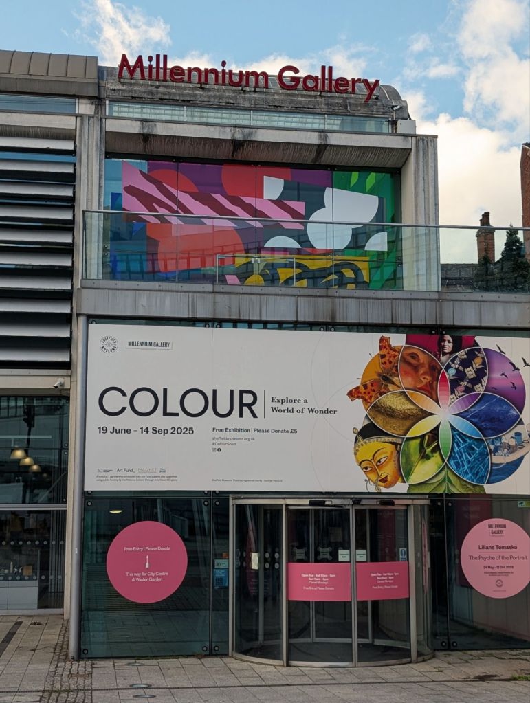
With that in mind, when I had the opportunity to visit the Millennium Gallery in Sheffield for the first time while the Colour exhibition was running, I thought it was finally time to transition my exhibition round-up posts over to my blog and what better way to start than with a gallery so close to home.
I was initially drawn to this exhibition when I was told there was going to be art within it by the likes of artists such as Hokusai, Kandinsky, Bridget Riley, Lichtenstein & many other incredible artists of different mediums and styles.
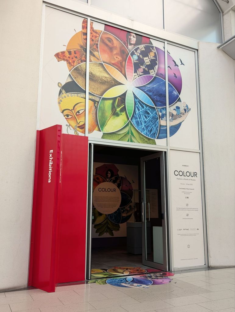
This exhibition was held from 19 June 2025 – 14 September 2025 & my husband and I managed to pay the gallery a visit towards the tail end of its run on September 12th. The exhibition brought together over 150 objects spanning art, science, nature and cultural histories, alongside a range of interactive activities, exploring the spectacular world of colour – how we see it, how it’s made, how it’s used & what it means.
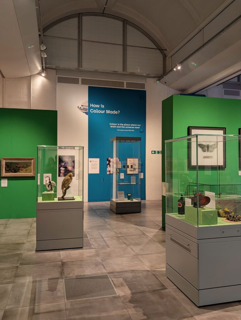
Upon entering the exhibition we chose to head to the section that focused on what colour means, which explored the emotional, cultural, and symbolic power of colour. We then moved onto the section that focused on how colour is made, which explored pigments and dyes from plants, minerals, and more. After that we explored the section that focused on the usefulness of colour & showcased how humans and animals use colour to communicate or hide. We lastly finished off our time at the exhibition by exploring the section that focused on what colour is, which served as a way to investigate the science of how colour is seen and understood.
While walking through each section, I made a point of noting down the art and other objects I was immediately drawn towards, to guide this post down a focused path as opposed to rambling endlessly trying to cover every aspect of the entire exhibition, which would make for a very arduous read overall, and would provide neither you or I with very much enjoyment.
Whilst I had a long list of highlights, I chose to narrow it down to 9, so my highlights from this exhibition included but were not limited to:
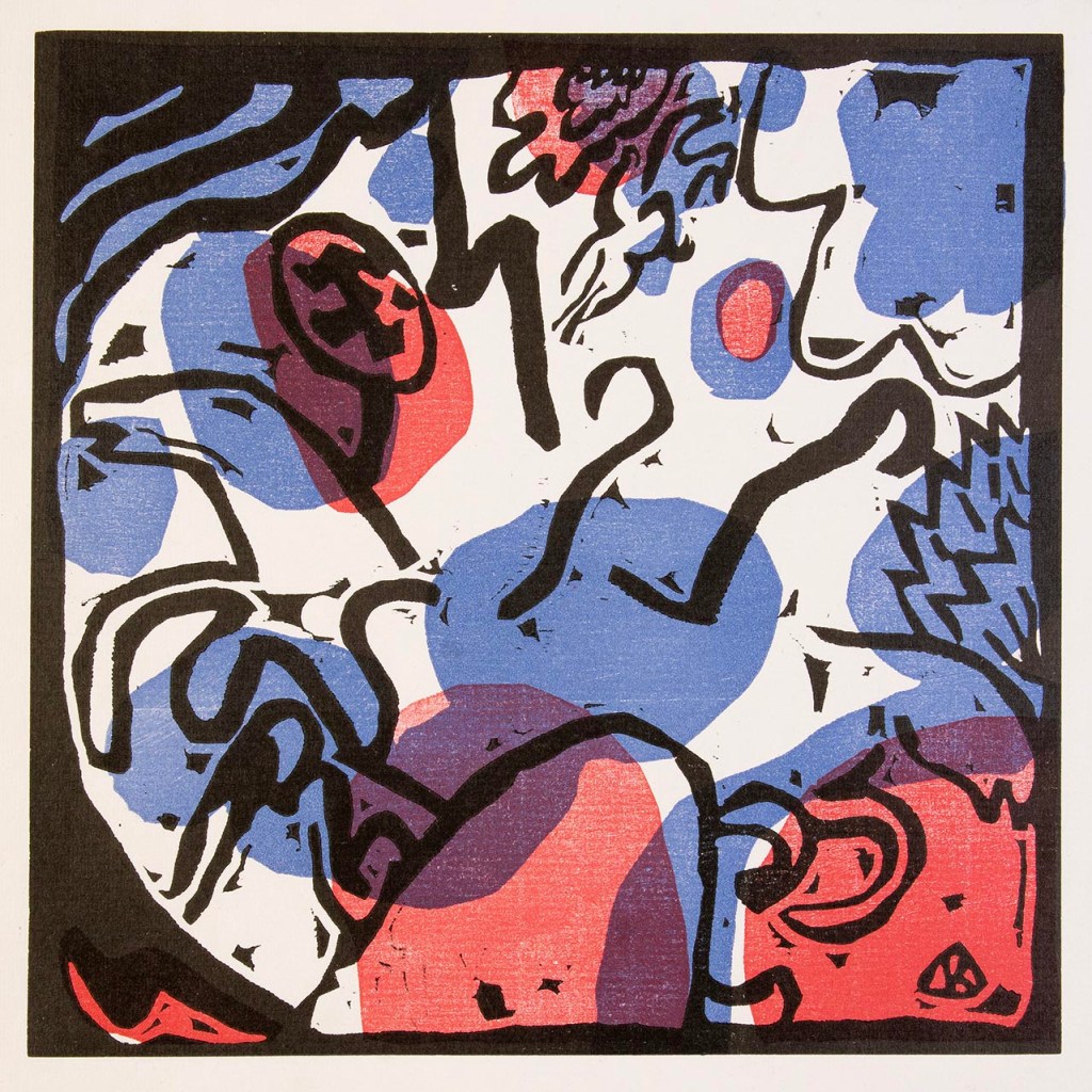
Drei Reiter in Rot, Blau and Schwarz [Three Riders in Red, Blue and Black], around 1912 – Wassily Kandinsky (1866-1944) woodcut on paper.
This was the forest piece I was drawn to when we entered the exhibition because I am a huge fan of Kandinsky’s work and could tell it was his before I had even glanced at the information written beside it. His work has always spiked my interest because of the way in which sound -to-colour synaesthesia (Chromesthesia) affected his work and gave him the ability to share directly with the viewer what he was able to visualise what he was hearing. He believed that colour had / has a power which directly influences the soul and I couldn’t agree more. This was the first of many pieces I noted down in my book throughout the exhibition that predominantly featured blue. Little did I know at that point that it was going to continue to happen throughout the entirety of the exhibition.
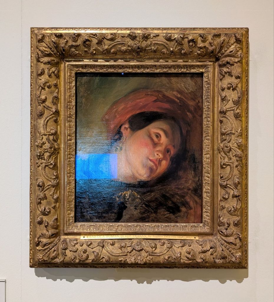
Head of a Woman wearing a Red Turban, 1830s, Eugène Delacroix (1798-1863) oil on canvas.
I was drawn to painting for a few reasons. Firstly, the colour palette, which is such a romantic palette overall containing earthy and dark elements, but softness and warmth alongside them. There are so many colours within this piece, layer by layer and yet it is not overwhelming and has a sense of welcoming comfort to it. Secondly, I was drawn to the way in which the light is captured with both drama and softness within this piece, you can immediately tell that the study was done by candle light due to the way it was painted. It adds an extra layer of warmth to that romantic colour palette and puts a focus on the woman without being direct and harsh.
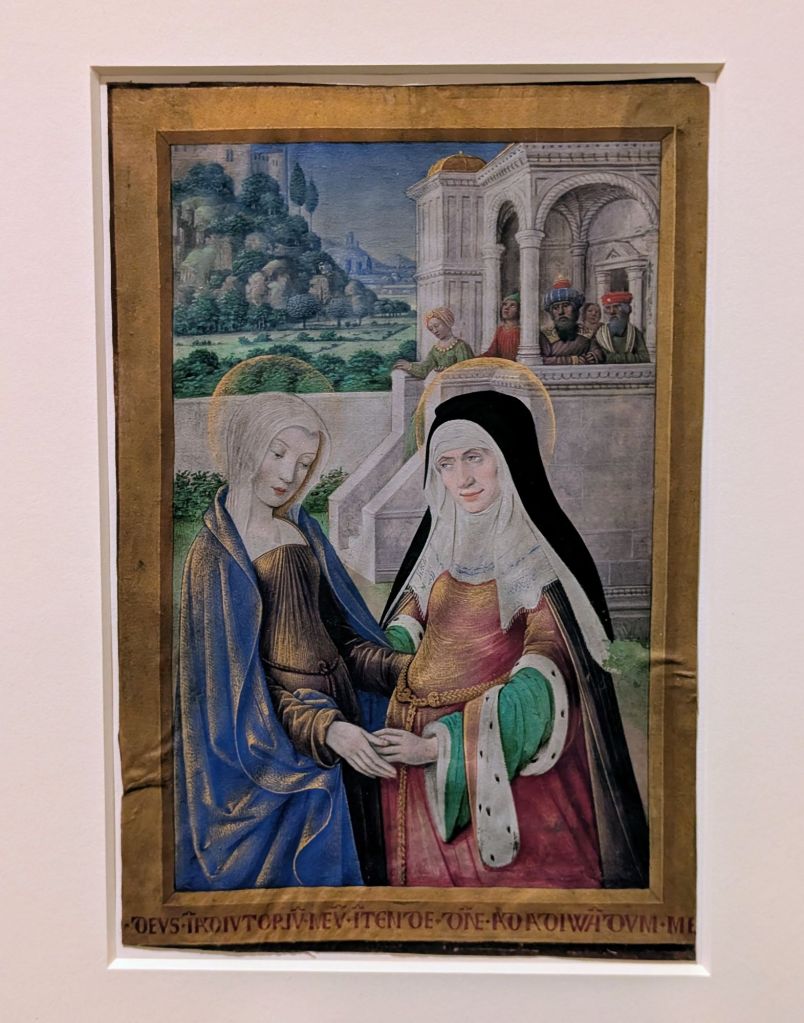
The Visitation, 1498-99 – Jean Bourdichon (about 1457-1521) tempera on parchment.
What drew me to this particular piece was not only the fact that it was from so incredibly long ago, but also the sheer amount of detail captured within something so small. The fact that it is not only painted on parchment but also painted using tempera is wildly impressive. While I am not religious in any way at all, I do enjoy learning about religious symbolism within art. One of my favorite details in this piece is the symbolic use of gold on both Mary and Elizabeth that is used to symbolise preciousness and purity. I also find the ultramarine pigment created using Lapis Lazuli to be unlike any other shade of blue, it always feels so special & overtime as I have learnt more about art, it has become a colour I specifically link to Mary in my mind even if the art that features it isn’t a religious piece. The way that our brains create those connections of time as we learn, grow and experience life, is truly beautiful.
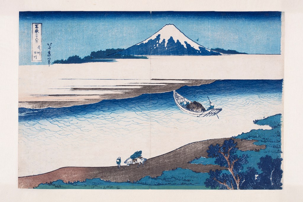
The Jewel River In Musashi Province (Bushu Tamagawa), 1830-1831
from Thirty-six Views of Mount Fuji (Fugaku Sanju Rokkei) Katsushika Hokusai (artist) Nishimuraya Yohachi (publisher) printed on paper.
Let’s be honest, there was no way that this wasn’t going to end up on my list of highlights, no matter the number of them I chose to include in this highlights list. This is the point in which I began to notice that I was being drawn to blue subconsciously, however I didn’t make the connection at this point as I knew I would have wanted to spend a decent amount of time with this piece before we had even walked into the door of the exhibition because it was one of the reasons I wanted to attend.
My favourite things about Hokusai’s work is the sheer amount of detail they have within them, how beautifully they capture movement and the ways in which different parts of the 36 views series truly did influence one another when it came to the colours used within them. The use of Prussian blue in this one, for example, recurring in many more seas and skies throughout the rest of his work.
Stonehenge, 2024 Periphery series Sarah Jane Palmer (sound by Marcus Campbell) gemstone, acrylic and emulsion on engraved wood.
This piece of art made it into my highlights not only because of how incredibly beautiful it is but also because of the way it made me feel upon learning about the inspiration behind it. Palmer created this piece after her father lost his vision to a brain tumour and she was inspired by the intricate iridescent lace-like pattern he described seeing in his peripheral vision. The artists visited 12 stone circles on a reflective pilgrimage and each of the paintings in this series corresponds with a dream or memory experience in one of those circles. This painting demonstrates the Troxler effect, in which colour shifts and disappears in the peripheral vision, and its aim is to encourage visitors to reconsider their own perceptions of reality and to contemplate how visual perception can be both fragile and transformative.
I spent a very long time with this particular painting because I struggle with chronic migraine that can affect my vision in a multitude of ways, including issues with going in and out of focus. Which means that while in front of this piece I was able to see it transform the longer I looked at it and noticed how it changed with my vision. I would love to have the opportunity to see more of this series of paintings in the future and spend the same amount of time with each one.
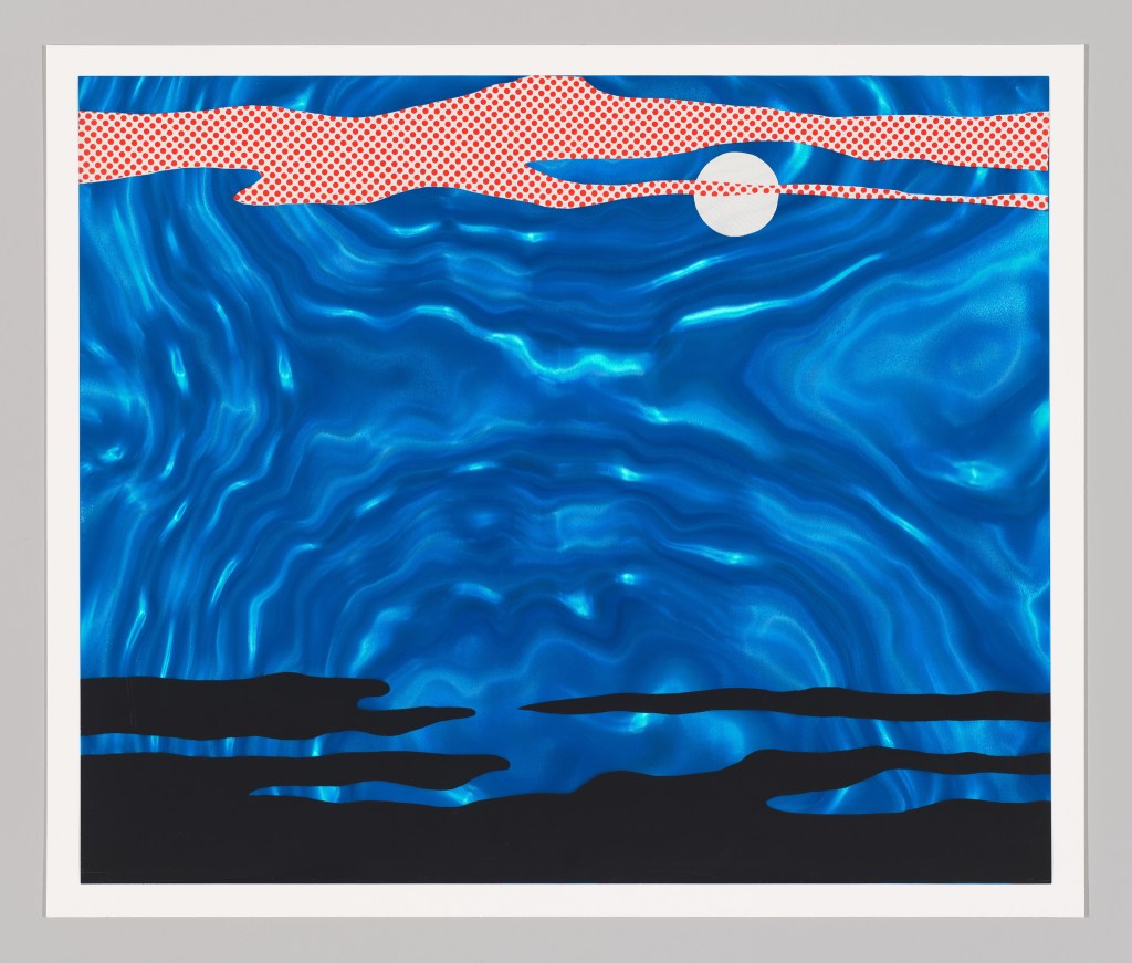
Moonscape, 1965 Roy Lichtenstein (1923-1997) screenprint on rowlux.
Here comes the blue throughline of this exhibition again. I knew prior to attending that there was going to be some Lichtenstein in this exhibition but not what it was so I was thrilled to see that it was one of his artworks I had never seen before. No matter their size or their medium, his work truly does stand out within a gallery space no matter what they are surrounded by. Of course, I found myself completely enthralled yet another piece of art in this exhibition that was predominantly blue. This one however had an extra level of emotion tied to it because it was not only blue but also centered around the moon, and it brought my Grandma to the forefront of my mind, not only because she adored blue but also because her favorite piece of classic music was Debussy’s Clair De Lune, so I know that she would have adored this piece and no doubt made the same connection to it that I did, which mean that I did get a little teary eye when stood in front of this piece, especially when I turned around to see a beautiful blue butterfly displayed close by.
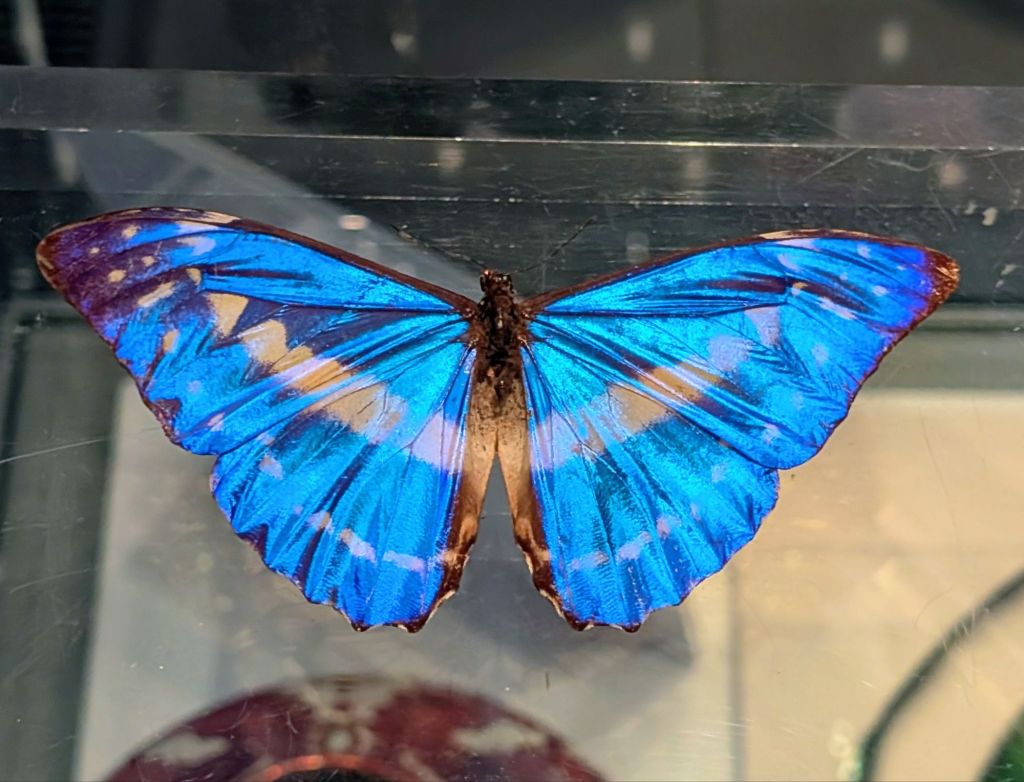
Blue morpho butterfly (Morpho cypris), before 1858.
The incredibly vibrant blue of the butterfly’s wings that matched the Lichtenstein piece perfectly & while looking at this butterfly that had been frozen in time so long ago, those emotions I had felt minutes prior in front of the Lichtenstein moonscape were instantly amplified. The magnificence of the iridescent blue of its wings instantly furthered the connection to my Grandma of which I found many within this exhibition. Having lost her not long before visiting, the emotions were still very raw and perhaps that’s why I found myself drawn to blue throughout this exhibition, over and over again. Part of me does wonder if I would have experienced this exhibition in a completely different way of the circumstances leading up to it were different, and whether I still would have been drawn to the pieces I was drawn to, but we’ll never know & that’s okay, because if anything it’s a fantastic example of how so many things we can’t control affect the way we view / read art and colour in general.
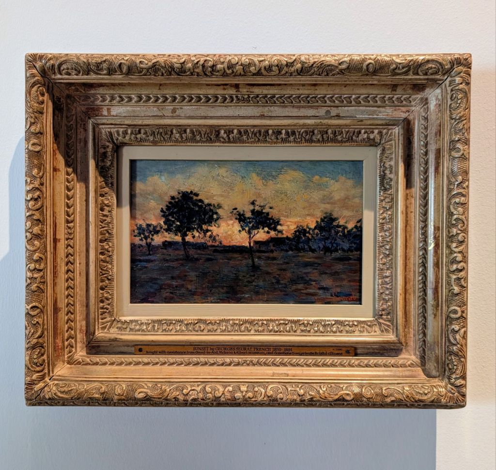
Sunset, 1881 Georges Seurat (1851-1891) oil on cigar box lid.
How could I not have included a Seurat painting in my list of highlights, they are such a pleasure to experience each time I am given the opportunity. This particular painting is quite small but I love the way that it was framed, with a frame that has three tiers that get smaller as they move towards the painting, drawing the viewer’s focus right into the center of the painting. Pointillism has always intrigued me because of the science behind the technique that turns brush strokes into individual dots of pigment, that when viewed from a distance optically blend in your eye to form a larger image, creating much more vibrant colors than can be achieved with traditional blending. The placement of complimentary colours within this piece provides a sense of movement, making it feel like you could sit in front of it and watch the sun continue to set, and discover how the environment changes with it.
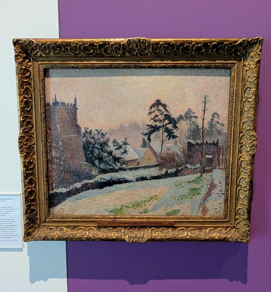
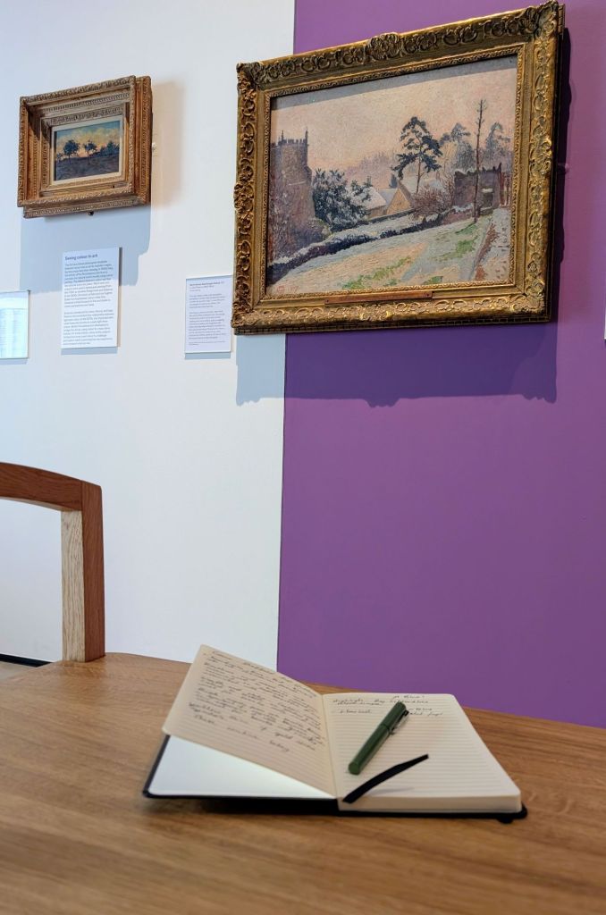
Snow Scene, East Knoyle Church, 1917 Lucien Pissarro (1863-1944) oil on canvas.
I am often drawn to impressionist paintings that depict winter, so when I rounded the corner in the last section of the exhibition and saw this pissarro painting I was thrilled to say the least. The reason I tend to adore Impressionist winters is because they capture the ice and snow in every way, not tied to detail but rather feeling and impression. The harsh hues and reality disappear, and a sense of magic replaces both. The palettes are wider, featuring so much more than the usual blues, white & creams tied to the season, enabling impressionists to build a reality of perception that holds so much power, capturing the beauty of the season as opposed to the harshness of it that is usually focused on. Impressionist winters like this are more immersive in my opinion and allow you to feel like you are experiencing the season yourself through time, rather than just viewing it.
This exhibition was jam packed with incredible objects of all different mediums, with objects spanning art, science, nature and cultural histories and I truly did learn so much during my time at the Millennium Art Gallery, because it was clear that such a sheer amount of hard work, care and attention was put into the curation of this exhibition, with every additional detail and creative choice made throughout adding an extra layer of depth and richness to the overall experience.
I really do hope that if you’d made it to this point in this post that you have enjoyed the new long format of my usual exhibition round ups. I found it to be a much more beneficial way for me to look back at this exhibition and truly process my thoughts on the experiences as a whole, so I will definitely be doing this for many more exhibitions moving forward.
If you happen to have, had the chance to experience this exhibition for yourself, I would love to hear about your experience and which pieces are on your highlight list, in the comments & If you want to Find out more about the Millennium Gallery and future exhibitions you can do that here.
Until next time, Happy Steeping – Kimberley

You must be logged in to post a comment.